Almost nothing goes wrong in the animation. In ten years of making these, the projects that ran late, grew, or ended in a video nobody was quite happy with went wrong in the fortnight before anyone animated a frame, and nearly always for one of five reasons. None of them are about craft. All of them are decided in the first week, which is the good news, because that is the cheapest week to fix anything.
1. Nobody said who signs it off
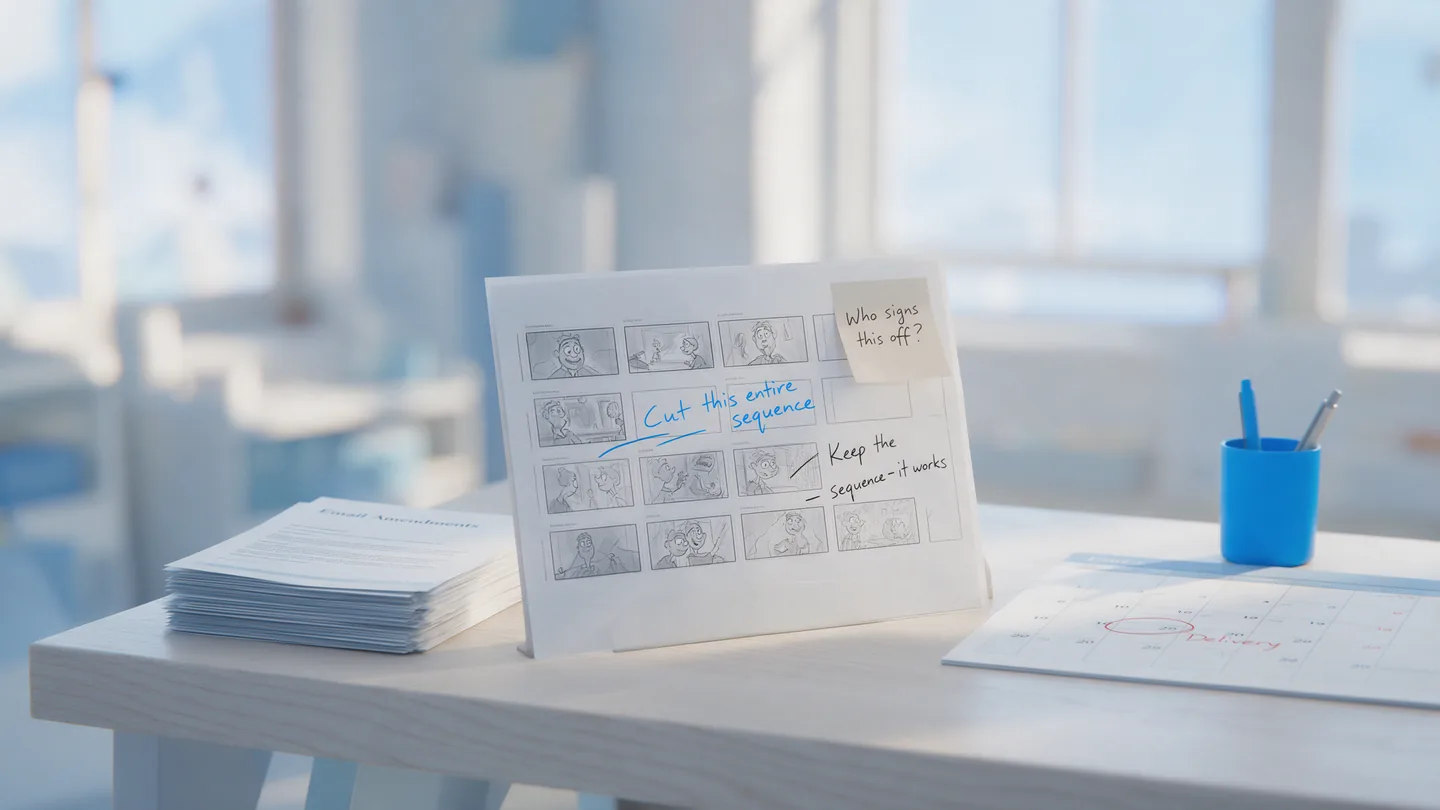
This is the single biggest cause of a late animated explainer video, and it is almost never recognised as a problem at the start. A project begins with one enthusiastic contact. Then the storyboard goes round, and suddenly there is a founder with a view on the colours, a head of sales who wants a different opening, and a compliance team nobody mentioned.
What follows is not really a revisions problem. It is that no single person has the authority to say “yes, that’s it”, so the video circles. We have had projects where the animation was finished well inside the schedule and the sign-off took longer than the production did.
The fix takes one sentence at kick-off: name the person who gives final approval, and name everyone who gets a say before them. If legal or compliance is on that list, say so on day one rather than at storyboard. If the person signing off is on holiday in week three, we would rather know in week one.
2. Feedback arrives in pieces, from several people
Four separate emails over three days, each from a different person, two of them contradicting each other. It is the most common shape feedback takes and the most expensive, because every round of amendments has a fixed cost in time regardless of how small the note is. Changing one line of voiceover means re-recording, re-timing the scene around it, and often re-timing the music cue after it. Doing that four times for four notes that could have arrived together costs about four times as much as doing it once.
Worse, contradictory notes force us to guess, and guessing produces a round that pleases nobody.
So: one person collects the feedback, reconciles the disagreements internally, and sends it as one list. If two stakeholders want opposite things, that needs settling on your side of the desk, not ours. It is why we work through one point of contact as standard. Not to keep people at arm’s length, but because consolidated feedback is faster and produces a better video.
Revisions themselves are not the thing to be cautious about. Amendments are unlimited and included in our price, so there is no cost in asking for a change. The cost is in the shape the asking takes.
3. The content doesn’t exist yet
A project is signed off, the schedule is set, and then at storyboard stage it turns out the product screens are from an old version of the app, the logo only exists as a JPEG from a 2019 brochure, the data in the chart hasn’t been approved by anyone, and the brand guidelines are “somewhere in Drive”.
Nothing stalls a project like waiting on assets. And it is rarely anyone’s fault. The assumption is simply that these things can be dropped in later. Sometimes they can. But a product screen is often the thing a whole scene is built around, so a late one is not a late detail, it is a scene rebuilt.
Before the schedule is set, get these in one folder: vector logo files, brand colours as hex values, the font or a note that you don’t have one, current product screenshots or demo access, and any figure or claim that already carries internal approval. If something genuinely doesn’t exist, tell us. We will design around it, which is fine, as long as we know we are designing around it rather than waiting for it.
4. Nobody ranked the messages, so the scope quietly grew
This one is slow and almost invisible while it happens. The brief says the video needs to explain the platform. Then it should probably also mention the integration. And really it ought to cover the new pricing. And someone points out it would be a shame not to show the mobile app.
No single addition is unreasonable. Together they turn a ninety-second video into a three-minute one, and because pricing is per finished minute, they roughly double the cost, usually discovered at the point where cutting feels like loss rather than editing.
The protection is to rank the messages before anything is written, not list them. Three things, in order, and an explicit note that number three is the one that goes if the video runs long. A ranked list of three beats an unranked list of eight every time, because it makes the cutting decision in advance, calmly, instead of in week four under pressure.
This is most of what a good brief for an animated explainer video is actually doing: deciding what the video is not about.
5. The script was written to fill the time, not to land a point
Scripts arrive long. That is normal and not really a mistake. The mistake is a script written as a tour of the product rather than an argument for it: everything the thing does, in the order it appears on the website, with no single point that the viewer is supposed to leave holding.
You can usually spot it in the opening line. “Founded in 2016, we are a leading provider of…” is a tour. “Your team spends four hours a week copying numbers between two systems” is an argument.
A ninety-second video is about 220 words of voiceover, which is roughly half a side of A4, which is room for one idea, properly made. If you want the mechanics, how to write an explainer video script covers the word counts and the five beats. For this list, the only point is that a script approved before anyone checks it against a stopwatch is the most expensive document in the project.
The one that costs the most: changing your mind at the wrong stage
Worth separating out, because it is less obvious than the other five. Every change has a price in time, and the price goes up steeply with every stage it is left:
- Script. A rewrite is an hour.
- Storyboard. Restructuring a scene is half a day.
- Animation. The same change is a day or more, because the voiceover, the timing and the music all move with it.
The practical consequence is that the storyboard is the last cheap moment, and it is the one most often skimmed. It arrives looking rough, which is the point of it, and because it looks unfinished, people approve it in the spirit of “yes, carry on”. Then they see the animated version, which is the first time it looks like a video, and that is when the real reaction arrives.
Read the storyboard as though it were the finished video. If a scene does not make sense flat and silent, it will not make sense animated. We would much rather spend an extra day there with you than a week unpicking it later.
What a project that goes well actually looks like
Dull, mostly. The pattern is consistent enough to describe:
- One named approver, and everyone who gets a say named on day one.
- Three messages, ranked, with the third marked as expendable.
- Assets in one folder before the schedule is agreed.
- A script read aloud against a stopwatch before it is approved.
- Feedback consolidated into one list per round, by one person.
- The storyboard read properly, like a finished thing.
Do those six and an animated explainer video is a four-to-six week project that lands roughly when it was supposed to. Skip the first two and it becomes an eight-week project with a video everyone has slightly compromised on.
None of it is technical, and none of it is about animation. That is rather the point: by the time we are animating, the hard decisions are behind us. You can see how the finished ones turn out across our animated explainer videos and app and platform demos, and how we work lays out what shape the first conversation takes.